I thought you guys might like to know a little about the cover-making process in all its slightly shambolic glory. Our bosses would say it’s the most important part of the magazine, as it’s the best way of bringing new readers into our clutches. Mwah ha haha.
First a few facts…
1. We always shoot our own covers. Since we relaunched the magazine in 2008 every single cover has been styled by our team. Bar one though I won’t tell that story without eight sambucas in me first. By shooting our own covers we know the shot is exclusive, and is guaranteed to have our own unique look and interpretation of the rider stamped all over it.
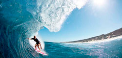
2. We always use pro riders and never models. We’re not interested in what a model has to say and nor are you. The realness, talent and dreamy dream lifestyle of the pro rider is what makes them so attractive and aspirational.
3. We never retouch a rider to make her look slimmer or prettier. There have been one or two covers where we have tidied up a rider’s skin, if they were having a bad day, at their request. The current cover of Steph Gilmore had no such retouching.
So how does it work?
1. First we home in on a target. We look at who’s been doing well in contests, who has a particular vibe about them and whether they have something interesting to say. In the case of Steph she is legend and we’d been trying to shoot her for a while but had been hampered by the fact she lives in Australia and we don’t. As it happened she came to Europe for the Swatch Pro so we approached her sponsors, Quiksilver Women, to see if they could get her to London as our acting fashion editor Britta Burger (and fashion ed Poppy Smith for that matter) likes shooting here, as she has a good network of photographers, studios and hair and make up people living round the corner from her house.
2. Next we decide on a theme. The fashion ed will research the rider, checking out past shoots, video parts, things they are into, and pull together a mood board, albeit sometimes only in her head. She will then pick a photographer to match the theme and discuss the look she wants with them and the hair and make up team. In the case of Steph, Britta saw some fashion shoots she’d posted on her blog which then inspired some of the outfit choices.
3. Then we call in the clothes. Pro riders are contracted to wear the clothes of their sponsor, so with Steph that’s Quik Women, so Britta will pull out a bunch of their clothes to fit the shoot’s vibe. She will also get some vintage clothes and the odd item from a non-conflicting brand such as American Apparel. From the clothes she’ll edit six or seven outfits but also take along spare other items to the shoot. They’ll probably be around 60 separate garments at a cover shoot.
4. And then bang we shoot!
What went on at Steph’s shoot is best explained through the medium of this video
And then the real work begins…
The photographer, in this case the excellent Nicole Maria Winkler took around 1000 shots, which she then edited down to 70 for Britta, who then edited that down to around 20 shots for me and our art director Chris Jones. Bear in mind some of these shots would run inside as part of the cover girl interview.
Of those 20 shots, normally two or three will stand out as possible covers, and sometimes just one, but in Steph’s case it was about 10, six of which you can see here (ignore the old cover lines and mish mash of fonts!).
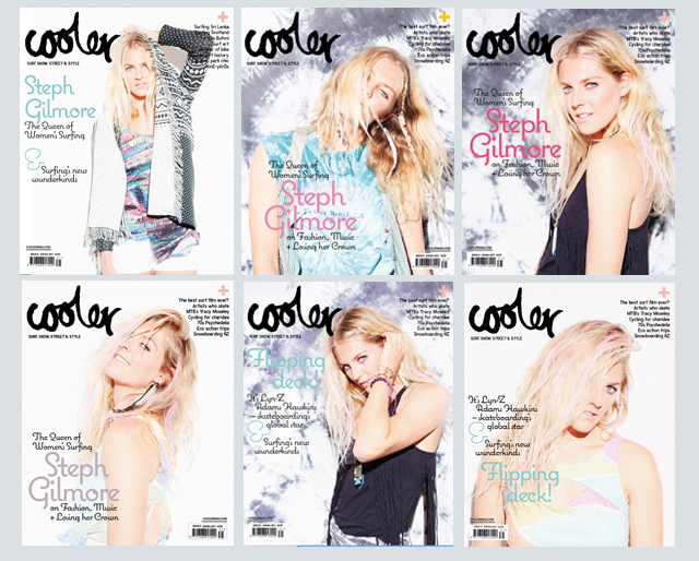
The Devil Wears Prada this ain’t and at this point I like to canvas as many opinions as possible, asking everyone from directors to interns, who as fans of the mag know what they like in a cover better than anyone. As always there’s a little tussle between those with an eye on sales (directors and marketing) and those of us who love beautiful design (the fashion and art eds and me), but we pretty much always win.
As a shot I loved the top left of the six (above) the most but it wasn’t a cover. Some people liked top right but we thought it was a bit too commercial. Britta, Chris and I all loved bottom left but we also really liked the tie-dye background from the other shots, and given that tie-dye was going to be everywhere this summer, we decided to try and patch the background from top right onto bottom left with, ahem, mixed results as you can see on the far left.
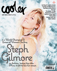
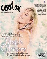
We then thought the tie-dye needed to match the shot more so set our friendly sometime retoucher Diane Sagnier to work (see right).
But after lots of chin holding in a circle around our art director’s desk we eventually decided the original shot with its original background worked best, though it had taken a little excursion around the houses to make us realise that.
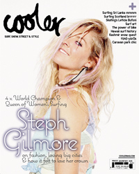
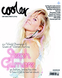 Then we just had to choose our final font colour, pink or purple, and boom we were done, with our latest issue rushing electronically down the cables to press.
Agree with our choice? If not head to facebook.com/coolermagazine to join in the discussion and tell us why.